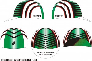
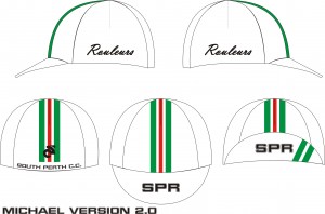
ok, we have had quite a few entries in for the cycling cap design and they are shown below. just click on each one to see a more detailed picture. i have done my own one where i have stolen design concepts that i like from the other caps. let us know your preference by adding to the comments section below. we will see what everyone’s opinion is and go from there. these are no way final designs, so if a lot of people like a design, but think it would look better in a different colour, we can easily change it. if we get the numbers, there is also no reason that we can’t get two different designs.
35 thoughts on “cycling cap”
Comments are closed.


+1 vote for Michael’s (not me) v1.0, the black one.. any chance we could explore the possibility of doing an alternate kit in a similar simple, classic, Euro style? Happy to push pixels if needed.. =]
Or we could always go real retro, a la LA’s latest look.. http://twitpic.com/1kbmew
Michael’s Version 2 is very nice
Michael V2.0 is my fave, although it looks like free advertising for Alitalia, (whom given their current financial status, i’m sure wouldn’t disapprove).
Basically, it’s probably slightly too-Italian in motif (not that that’s a bad thing).
On that note, Peter V1.0 is my pick. Any chances of a kit using the same principles???
I think we should keep the Cap simple and elegant i.e euro style.I’d go Peter 1
Michael’s v2 gets my vote.
Michael’s v2 would make a good winter version.
The 2Js (or Poseur 1 and 2) going for the whitest cap..
……….and you are surprised???
Michael V2, but without the horrid script font on the side
I’ll go with a Michael 2 with some reconfiguration of the stripes, as Jarrad said to de-italianize it. Black version good for Winter, just good to have two of anything cool. I’m seconding the comments regarding a classy euro style kit. Would stick out like dogs balls against the other over logo’d and too-busy-to-look-at jerseys being flexed by most cyclists these days. Has anyone got a spare set of knicks for Jarrad btw?
What Jarrad said
Ainsy, Jarrad said Michael V2 is his fave but Peter v1 was his pick.. I think he is trying to get some brownie points with the president as he has not written the Sat report yet.. We have all been waiting for something to read…
I vote Peter V1.0, it meets Euro Style approval.
(I also like the idea of a Euro white SPR kit – maybe a one-off special, or one that could be our official ‘race kit’?!)
Oh yeah, all white Pippo-style kit with a white and black stripe and nice tasteful poitioning of the sponsor logos……..not very cleaning friendly though.
Oh, and Brodie, i do actually own a set or 2 of SPR knicks, it’s just on Sundays i prefer the comfort of Assos.
Pippo style kit, that would be pure bliss
Micheal V1 or 2, and retro/race kit would be great
My vote is Pete’s V1.0. The defining colour for SPR, I think, is the “honey-combed” green. This is what makes the SPR colours stand out from the rest. Everyone else has a combination of white, black, red, blue, or yellow.
Poseur 2 agrees with Raph. Let’s keep it simple, white and green. The next SPR jersey (?maybe the racing version) should be a simplified, euro look version of the current one minus the stripes and the black.
Pete, this is a defining moment in your presidency. The cap has your name and pride on it!
I like Tracy’s version’s sides with Heiko’s front and back!!!! We gotta keep the hexagon motif going right?
Loving the retro look… cést très cool.
My fave would be Michael’s V.2 but I agree, the red stripe is a bit much. Maybe a black stripe in it’s place.
Regardless, I still have to figure out how to get all my hair into fit under it
At the moment my favourite would have to be Michael’s version 2, however i agree with lorraine a black stripe in place of the red one might be better. Also, i think that michael’s version 2 design could be improved if you used peters design for the underside of the brim instead.
Pete and Miguel Version 1 can we have both (damn you!) .. Gregors is good too !
Michael your version looks much better now that its coloured between the lines !! I like the horrid script Jordan …. and mine looks better with a black peak!
I want a pink one!!
Excellent effort all. My thoughts: Michael v2 or Peter v1.
My vote is Pete’s V 1.0.
The plain white with a little colour will always be stylish.
Gregors V1 without the side writing or script logo.
Peak with SPR on top and stripes as per Pete V1 but in green and black.
Pink! That’s a girls colour wouldn’t you agree Ryan?
Me thinks Kim may be sporting the same Manga top as Janelle soon.
Peter v1 but; replace the gay font with the standard block style font and make the colour strip just a little wider. White is such a hard colour to clean (spec when racing on the dirt)
Michael V2.0 for current strip
Pete V1.0 for euro classic kit (would look brilliant with big group)
Heiko 2 is my favourite – I like how the stripes match the front of the jersey.
1
Michaels V2
Maybe we can do a Rastafaran version for Lorraine.
Gregor’s design gets my vote
Heiko’s V2 with Michael’s V1 brim and South Perth CC on the back. I prefer the black versions as I’m told black looks more slimming on me:)
Oh.. by the way where is Tracy’s V1?
Michael´s V1.0 for Winter and V2.0 for Summer.
Only problem is that it screams ‘Hey, we like Colnagos & Campy here !’
Heiko’s V2. But in RED ;0)